The goal was to redesign the original WFS Ltd. website that had 10-15 webpages into a B2B CMS website that sold over 200,000 industrial products across Canada. Very early into the design process, I had to figure out a gameplan moving forward to problem solve and design for this redesign. This initial phase would demand rigorous introspection. What is the approach to efficiently categorize and present such a massive product range? How can the design facilitate intuitive and seamless navigation, especially for first-time users?
I knew I would need to have several conversations between leadership, our marketing and sales team to acquire insights moving forward. I would need to compile a competitive analysis to see what our competition is doing that is working as well as other B2B websites in other markets. At some point, I would need to either have interviews, surveys, or some sort of tests with 100+ vendors to get a better understanding of our users since I was designing a B2B website.
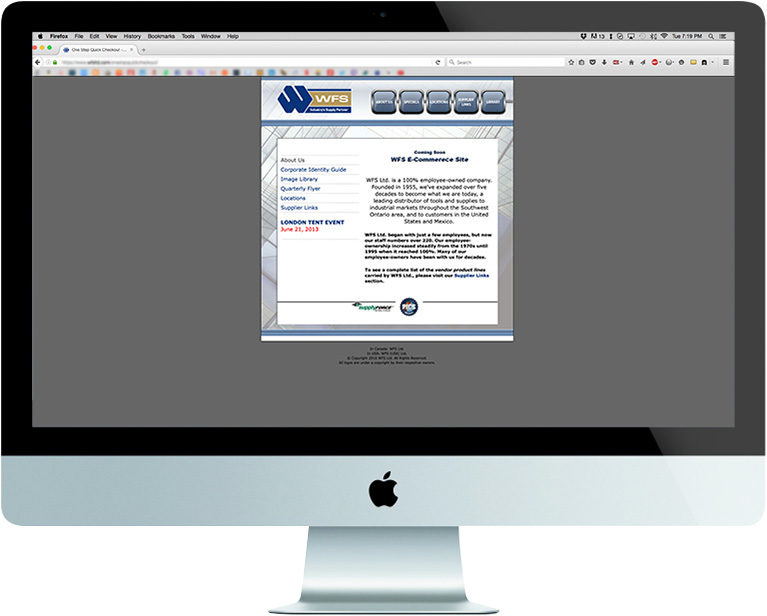
original WFS website
User research
During the discovery phase, I engaged in extensive data collection to formulate a strategic plan for the website redesign. This involved collaborative meetings with leadership, sales, and marketing teams to understand their requirements. Subsequently, I conducted a competitive analysis, benchmarking against our competitors and other successful B2B websites outside the industrial sector.
Surveys
Working with over 100 vendors, I developed surveys to identify their pain points, goals, needs, and motivations related to their experience on our previous site and other industrial platforms they've used. Given that these vendors are our primary users and potential buyers, gaining an in-depth understanding of their perspectives was crucial for the redesign process.
HMW problem statements
At this stage of the design process, I had done enough research and gathered enough data to create the HMW (how might we) problem statements for this application.
- How might we design a user-friendly, responsive B2B platform that efficiently categorizes and presents an extensive product catalogue, while facilitating seamless navigation?
- How might we synthesize insights from leadership meetings, vendor interviews, and B2B competitive research to formulate clear directions for our project?
- How might we revamp our navigation structure to accommodate the increase from a few webpages to hundreds of thousands effectively?
- How might we categorize the products in a way that is easy to understand and digest for our users?
- How might we improve the visual hierarchy and focus on our website to enhance the user experience?
- How might we optimize our previously desktop-oriented website for a variety of devices to improve accessibility and user experience?
Shortly after, I had a direction to start creating wireframes, low fidelity UI and create a layout for the website.
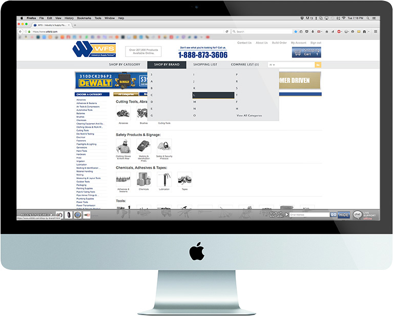
redesigned WFS website
60-30-10 rule
Given the project's extensive product range, my goal as a designer was to create a clean and professional website. Catering to a B2B audience familiar with their needs, I focused on making product discovery quick and efficient. The dominant white color scheme, complemented by light grays as dividers, facilitated easy categorization. To add a pop of color and highlight the brand, I incorporated subtle blue elements, matching the company logo.
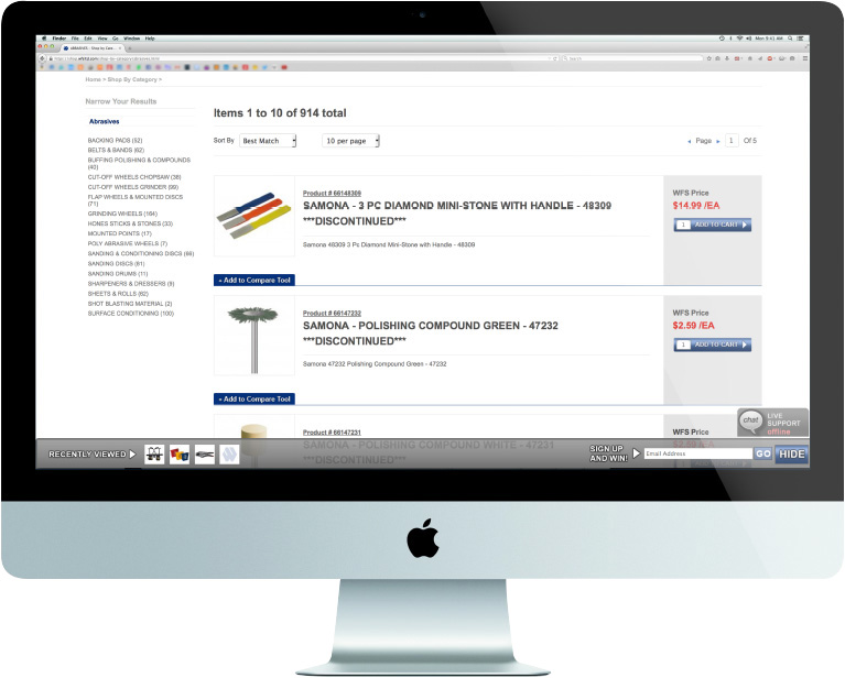
Focusing on where the eye goes first is crucial. The idea was for the consumer to look at the image, title and then price. Afterwards, you notice the "add to cart" button, then following are other aspects that aren't as important such as product number, WFS price, and extra details about said products at the end.
Catalog page
You can search for products either by category type or by the brand of the product. You then get linked to this page.
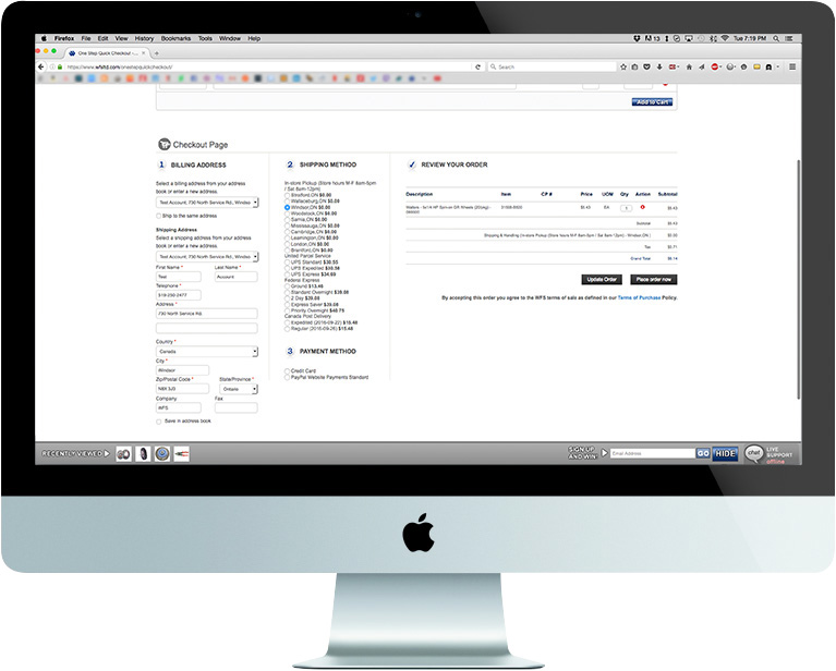
Cart page
Incorporating as much white space as possible, I wanted the consumer to be able to easily distinguish what they are looking at and find what they need quickly. Creating enough space between the categories made it simpler for the user to understand the information being presented.
Rich content
I regularly got in contact with 200+ vendors across Canada. The purpose was to acquire as much content as possible to add to our website.
Company website
www.wfsltd.com