Blue Cross Blue Shield of Michigan (BCBSM) is a renowned health insurance organization serving millions of residents in Michigan and beyond. BCBSM is dedicated to providing affordable healthcare solutions, fostering community well-being, and delivering top-tier customer service. Their commitment extends beyond just insurance, emphasizing comprehensive health and wellness support for diverse populations.
About the app
About the application
BAAG (Benefits At A Glance) is an application that is going to help internal resources manage certs and riders. Certs and riders are plan documents, which are very specific documents that are amendments to base plans. Certs and riders allows groups to customize base plans.
For example, someone who works for say X company may have 75% cover for maternity leave, but that company wants to change the cover to 90%. Our member agents would then use this app to make the change. The member agents can use this app to create, edit, or delete the custom plans when the member or group of the company they work for requests it. This process is always used with certs & riders.
BAAG application
BAAG
2022
Health care
Responsibilities
Conceptualization, user research, define HMW problem statements, high fidelity mockups, user testing, design hand off, design system, manage developers.
I was the product designer who worked with a newly built engineering team and their tech lead. My goal was to take the requirements from 3 different departments and redesign the BAAG (Benefits At A Glance) application. Some important tasks early on were to figure out the direction of the application. I needed to gather more data and figure out the information architecture to ensure the content was intuitive to find and process for the member agents.
I had to figure out the navigation included in the app and how to create a UI that helps member agents be efficient. Member agents work on a lot of certs and riders every day, what features can I add specifically to speed the process? Are there additional features I can add to make the member agents' jobs easier? Where do I begin and what do I need to know before I start designing? I started on the discovery phase of the double diamond methodology, by breaking down different issues and questions to get a better understanding of what I need to do moving forward.
User research & interviews
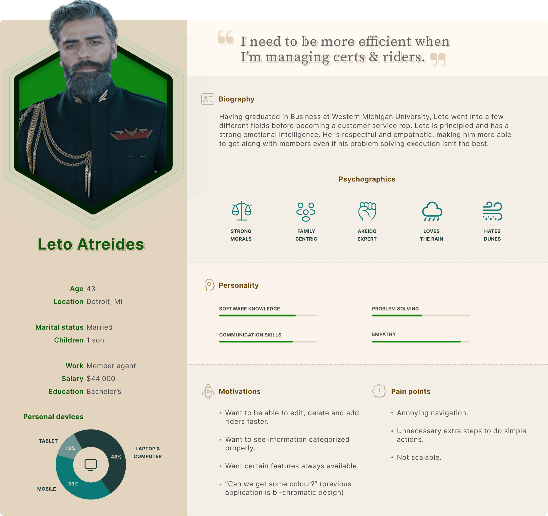
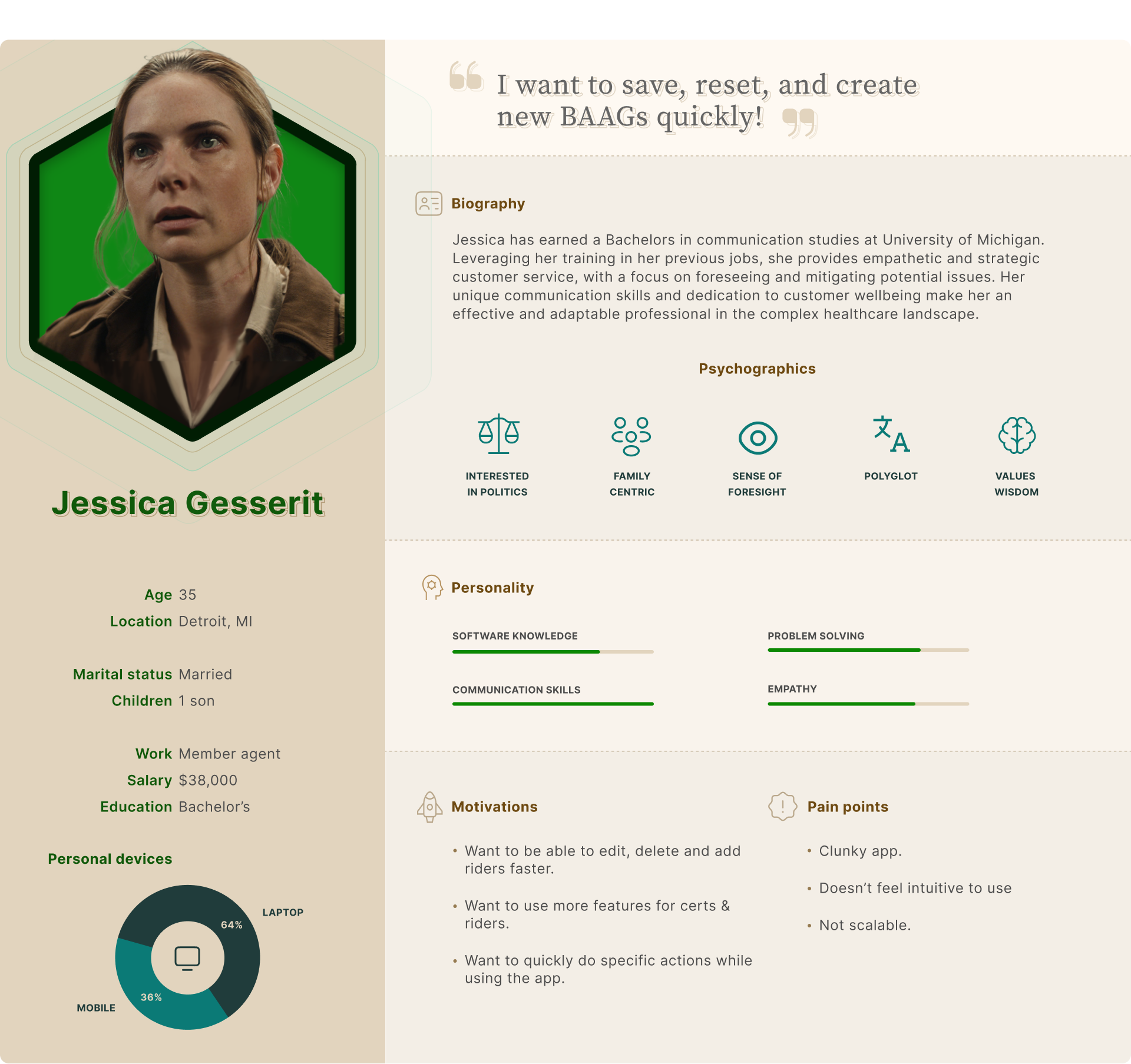
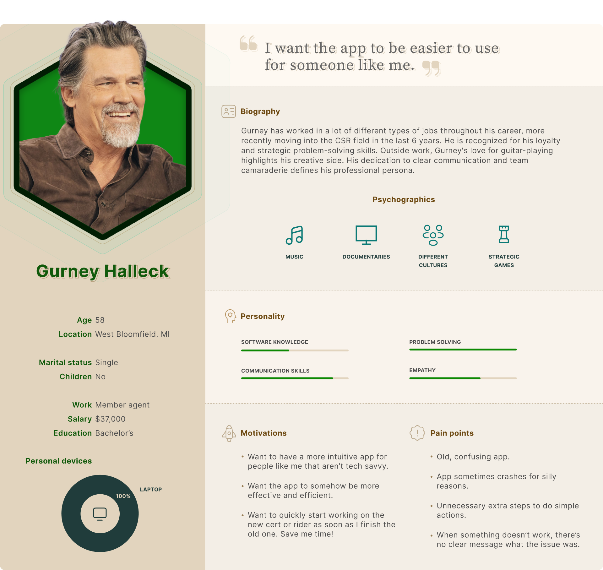
After reviewing their requirements, I did some competitive analysis and user research in the discovery stage to try to figure out which direction to go in this application. I contacted member agents who worked on the previous application in regards to issues that they had. After conducting interviews during the week, I compiled information in terms of goals, needs, and pain points so I could start creating personas to empathize with users. The main issues they had were a general lack of features on the previous app, ease of use, clunky navigation, and the need to quickly use specific features.
Persona #1: Leto Atreides
Persona #2: Jessica Gesserit
Persona #3: Gurney Halleck
Empathizing with member agents
Speaking more with the member agents, they wanted specific features added to this application. They dealt with so many certs & riders throughout the day, their main priority was being able to add, edit and delete as many of these as possible. In the previous app, doing the same action over and over again took more time than it needed, and it had certain information that didn't help them achieve their goals (which we later removed). Trying to understand and empathize with the member agents helped me to start defining out the issues we needed to resolve.
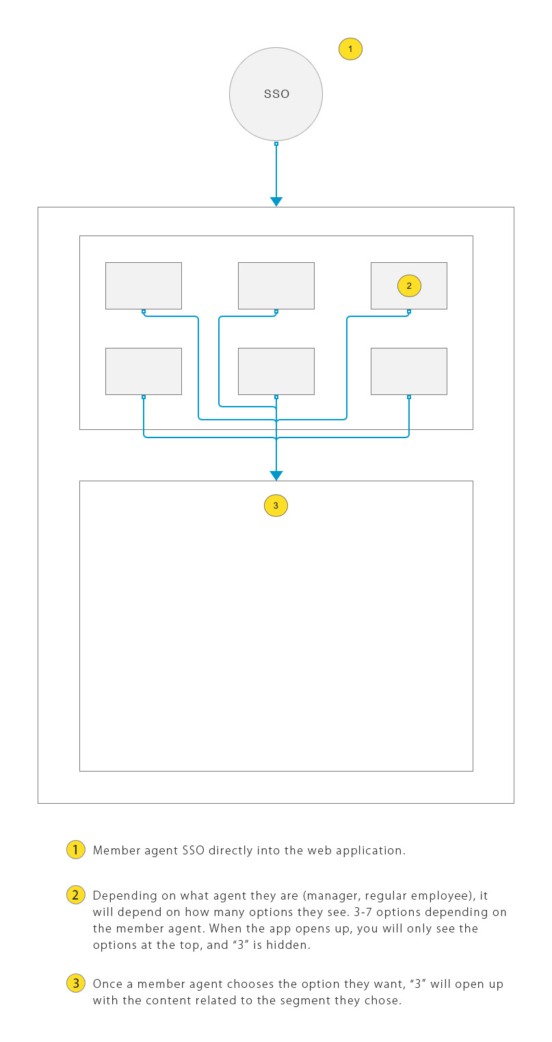
User flow of the application
Understanding the user flow
With enough information gathered in the discovery stage, I was able to construct a user flow to help leadership and member agents understand the basic user flow of the application. A member agents SSOs into the app, then chooses a category with the content appearing and anchering them below. Given this comprehensive understanding of user flow, navigation, and insights, I was positioned to formulate the How Might We (HMW) problem statements.
HMW problem statements
At this stage of the design process, I had done enough research and gathered enough data to create the HMW (how might we) problem statements for this application.
How might we help member agents who encounter difficulties in efficiently managing Certs and Riders?
How might we streamline the navigation to remove unnecessary steps for accomplishing simple tasks?
How might we categorize large volumes of information in a way that's easy to digest and read?
How might we enhance the color schemes to establish a clear visual hierarchy and focus in the app?
How might we make the app responsive to cater to various desktop views and screen sizes?
How might we optimize the application to speed up the tasks performed by member agents?
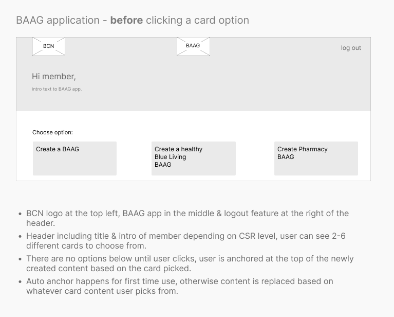
Wireframe #1: Choosing cards to view content
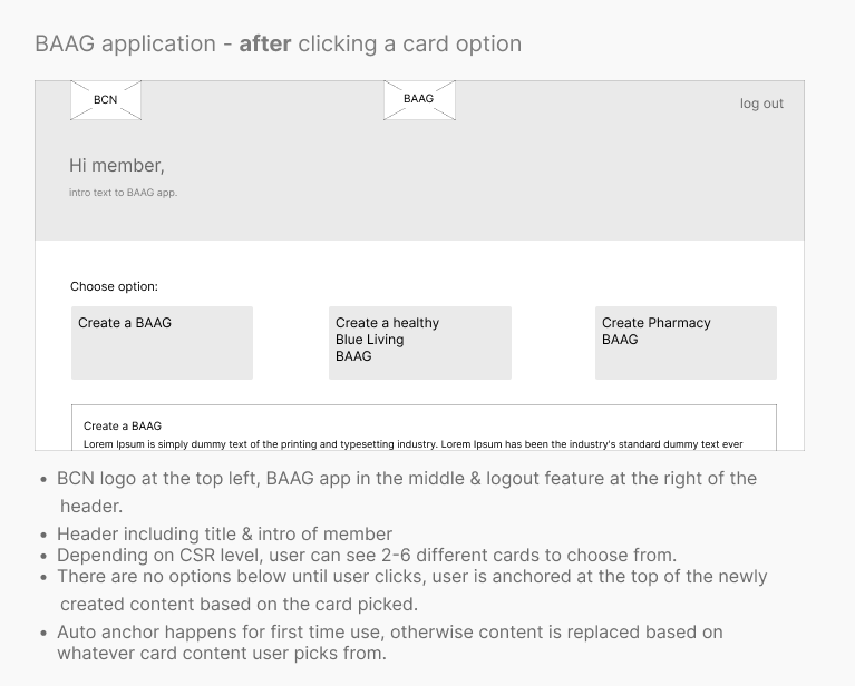
Wireframe #2: After clicking Create a BAAG card to view content
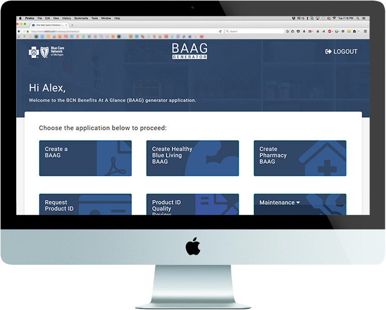
High fidelity UI: Introduction to BAAG app
Navigation & content
Member agents go through several plan documents to add, edit or delete throughout the day. Speed and efficiency were critical components of the design process. After spending some time ideating on creating different wireframes, I created a navigation with the 6 options shown in the images. Clicking any of them opens up the content related to that category directly below. On page load, the first time you click a navigation button, it scrolls you down and opens up the content related to it for speed. If you click on any of the other navs without reloading the page, it replaces the content below without anchoring you to the content.
The goal in terms of UI was to create a very simple user flow. I went with a white background and with gray elements as input fields or dividers.
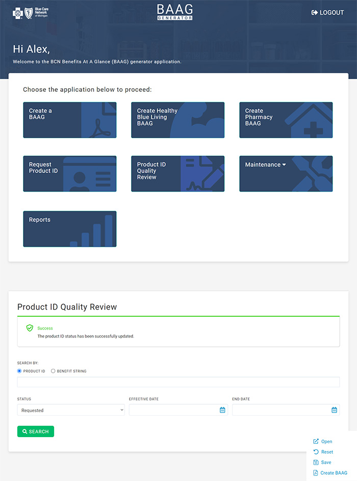
full view of the Product ID Quality Review page
The BAAG assistant
As stated above, one of the things they wished they had in their old application were certain features that they could access quickly without needing the navigation. Some features were simply not available due to software limitations on the previous app like "Save" and "Reset". I decided to create a container that has a fixed position at the bottom right because these four buttons were features member agents would regularly use on a daily basis. A lot of the design process revolved ensuring they can customize the plan docs as efficiently as possible.
Achievements
Easy to use navigation
Following executive consultations and comprehensive user research, I developed intricate user flows, personas, and high-fidelity wireframes to serve as a comprehensive guide for member agents within the application. By introducing an intuitive navigation system, I enhanced the efficiency of member agents, enabling them to manage a higher volume of calls daily.
Engaging user interface
In contrast to the original app's bi-chromatic design, I implemented the 60-30-10 color rule, enriching the palette with hues of blue while introducing relevant iconography and images. The use of white or light gray for background coloration improved visual hierarchy, enhancing legibility and guiding member agents intuitively through the UI elements.
Responsive design
The predecessor application, lacking scalability, was confined to a single media query. I addressed this limitation by implementing a responsive design, thereby facilitating usage across varied devices, including mobile phones and tablets, as required by member agents. This allowed for future scalability and reach.
Efficiency
The preceding application faced significant limitations regarding operational efficiency. In reengineering the platform, I prioritized not only structural speed but also introduced a BAAG assistant. This feature incorporates essential buttons, frequently accessed by member agents throughout the day. This strategic addition substantially bolstered both efficiency and productivity.
Moving forward
I was moved to another team shortly after the product was released, but I would have liked some extra time to iterate and enhance this application even further.
User feedback analysis: Gather feedback from member agents who are actively using the application to manage certs and riders. Analyze their experiences, pain points, and suggestions to identify areas for improvement.
Usability testing: Conduct usability testing sessions with member agents to observe their interactions with the application and gather feedback on the user experience. Identify any usability issues and make iterative design improvements based on the findings.
Design iterations: Based on user feedback, usability testing results, and metrics analysis, iterate on the design of the application. Address any navigation issues, improve visual hierarchy, and refine the user interface to enhance usability and user satisfaction.
BAAG assistant: Interview member agents and see if the assistant has all the features they require, and its location at the bottom right, and listen to any concerns or suggestions they may have.