wePay is a fictional mobile application company created to simplify the often complex process of splitting restaurant bills among groups. Catering especially to millennials, young professionals, roommates, and larger gatherings, this app seeks to address the challenges faced when trying to evenly divide expenses, ensuring transparency, fairness, and convenience.
About the app
About the application
wePay is a meticulously designed mobile application dedicated to simplifying the often complex task of splitting restaurant bills among groups. Designed for a diverse audience, ranging from young professionals to travelers, the app addresses the challenges of dividing costs fairly, integrating seamless payment systems, and ensuring intuitive navigation for first-time users.
Through comprehensive user research and competitive analysis, "wePay" embodies a user-centric design approach, ensuring fairness, transparency, and convenience for dining groups. While its primary function revolves around restaurant billing, the app's vision is geared towards evolving its functionalities, enhancing user experiences, and extending its applications beyond just dining scenarios.
wePay application
wePay
2023
Tech
Responsibilities
Conceptualization, user research, define HMW problem statements, high fidelity mockups, user testing, design hand off.
The goal in the beginning was to create the experience for an application where you fairly split a bill between a group of pepople dining together. In the early stages of conceptualizing, there were loads of fundimental questions. At the core, understanding the target user becomes paramount. Who are they? What drives their need to split bills, and in what contexts do these needs arise? What their strengths and shortcomings? How does one ensure a seamless payment experience or craft an intuitive user flow that even first-time users find easy to navigate? How are group dynamics handled? Would the app accommodate instances where only specific items need to be split among certain members of a larger group?
Outside of the functional aspect, a deeper introspection would be on the emotional & behavioral patterns of users.
Who, when, where, why
During the discovery stage, getting a better insight on who, when, where, and why would help me gain a holistic understanding of the problem and to ensure that the designs are tailored to the user's needs and context. Figuring out these questions, I would ensure that the solutions are user-centered, contextually relevant, and purpose-driven, leading to more effective and successful product.
Who?
Young professionals and millennials
Students
Roommates or flatmates
Coworkers
Large families or groups
Travelers
When?
Regular social gatherings like brunch, dinners, or drinks with friends
Team lunches, happy hours, or work outings where the bill needs to be split
Dining out for family gatherings or during holiday outings where multiple families are involved
Group trips for meals
Where?
Restaurants
Cafes
Why?
Fairness and transparency
Convenience
Time saving
Versatility
Expense tracking
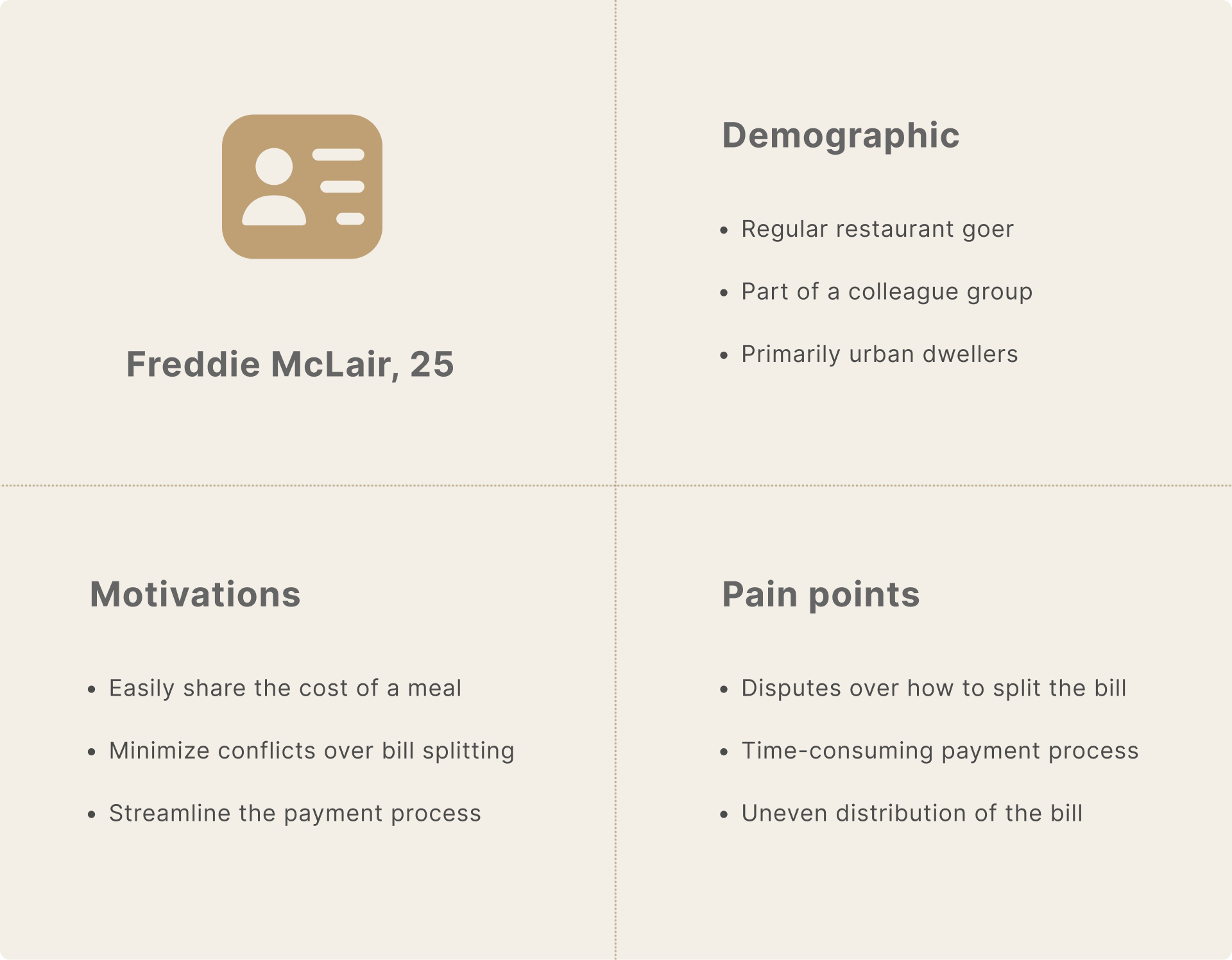
After finalizing the who, what, where and why, I created a quick proto-persona. The reasoning was for rapid ideation this early into the process, establishing a foundational understanding of potential users. This allowed me to begin the design process without waiting for extensive research. Also because they are based on assumptions, proto-personas can be easily adjusted or pivoted as more information becomes available.
Proto-persona: Freddie McLair
Competitive analysis
I wanted to research successful applications to see what is working for them and what some of their pain points are. What are users who use these apps looking for? What annoys users about the apps they currently use, how can I avoid some common pitfalls? If I can understand some of the strengths and weaknesses of apps that are out right now, it will allow me to set benchmarks for their app in terms of functionality, usability, and design.
Splitwise
Positives
Intuitive user interface and design
Keeps a running total of who owes what and provides a simplified solution of repayments
Offers expense categorization and tracking
Integrates with PayPal and Venmo for easy transactions
Pain points
Lacks features for split payments in percentages
No in-app money transfer for users outside the U.S.
Venmo
Positives
Simple to use with a social media-like design
Directly linked to a user's bank account or credit card
Real-time transactions with other Venmo users
Pain points
Public by default; privacy settings have to be manually adjusted
Only available in the U.S.
Zelle
Positives
Direct bank-to-bank transfers, no need to cash out
Real-time transactions with other Zelle users
No fees for sending or receiving money
Pain points
Need to have a bank account with a Zelle partner to use
If the recipient doesn't have Zelle, it can take 1 to 3 business days for them to receive the money
Acquiring insights & developing personas
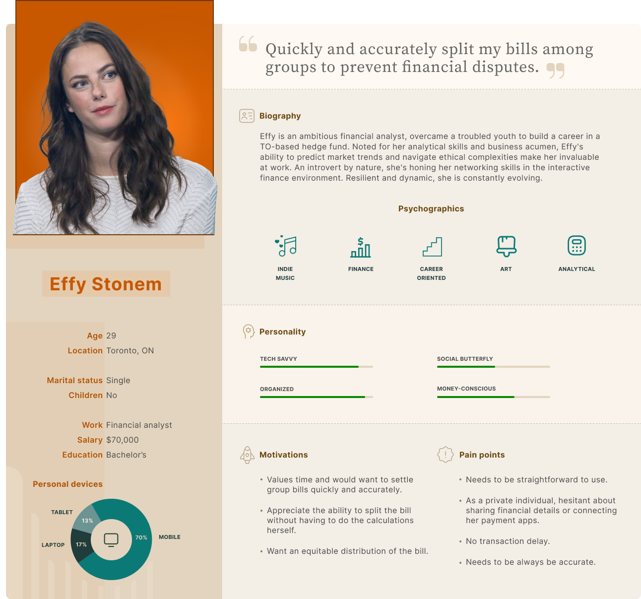
I compiled information from 7 user interviews to get an understanding of goals, wants, needs, pain points and from what type of people this information is being extracted from. These were primarily conducted over video calls, ensuring a blend of convenience and personal connection. The interviewees presented a diverse mix, ranging from young professionals to seasoned diners, each bringing a unique perspective to the table. A recurrent theme that emerged was the desire for transparency and efficiency, with several individuals highlighting past experiences of awkward bill-splitting scenarios. Converting these rich narratives and sentiments into personas, I introduced figures like 'Effy', a 29-year-old financial analyst who due to her job, is often visiting restaurants with clients or co-workers to network. This persona-driven approach wasn't just theoretical; it directly shaped design decisions, ensuring our app wasn't just functional, but also resonated with real-world user emotions and desires.
Persona #1: Effy Stonem
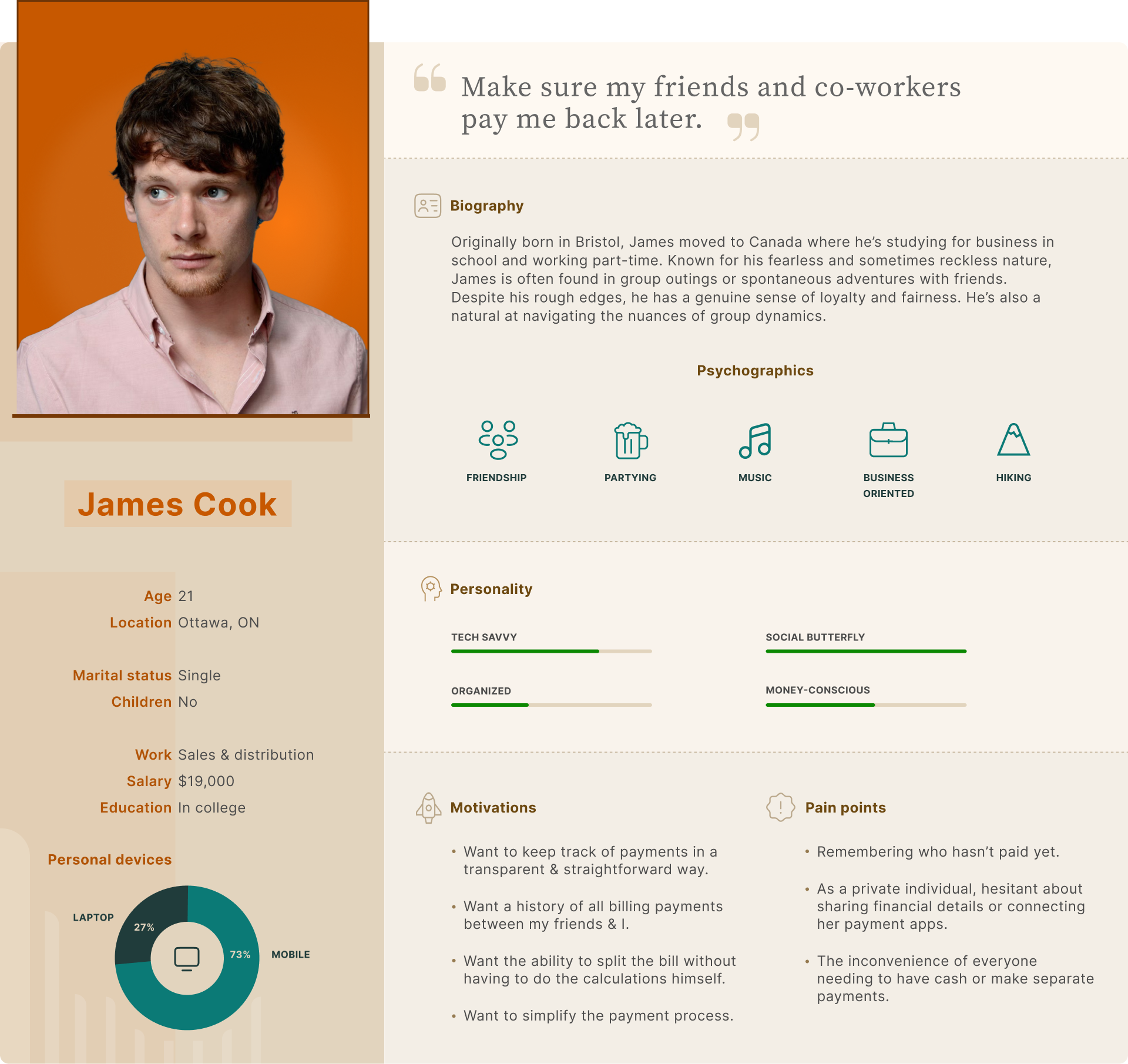
Persona #2: James Cook
HMW problem statements
At this stage of the design process, I had done enough research and gathered enough data to create the HMW (how might we) problem statements for this application.
How might we create an app to fairly & quickly divide restaurant bills, minimizing common pain points of similar apps?
How might we integrate with payment systems to allow for seamless and immediate bill payment from within the app?
How might we ensure that the app interface is intuitive enough for first-time users to navigate without difficulty?
How might we handle situations where users want to split an item among a subgroup within the larger group?
How might we incorporate features to save previous split details for recurring group outings?
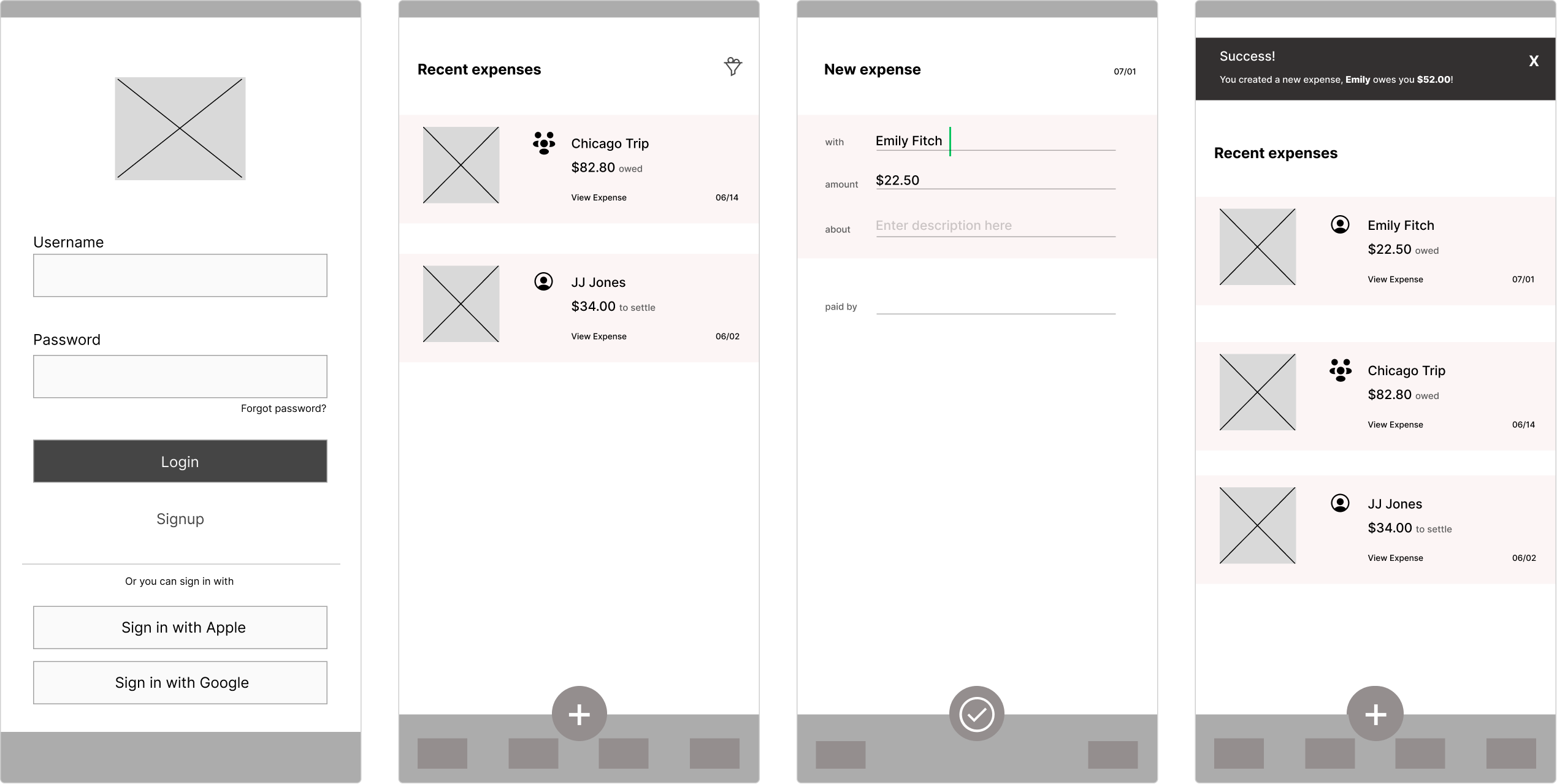
User flow
During the define stage, after conducting interviews, user research, competitive analysis, and creating personas, I've obtained a clear enough understanding of my users' goals, motivations, and pain points. This research has allowed me to identify common patterns and behaviors, which will be essential in designing a user-centric product. Below, I present the user flow of the application, which has been constructed based on our users' needs and preferences.
wePay user flow - login section. Click here for a bigger view.
Creating the layout
Moving into the development phase, the focus turned to the architectural and visual components of the app. Armed with the information collected, I created a multitude of sketches on paper before creating more defined wireframes on Figma. Each iteration served to refine and shape the design, edging closer to a user-friendly interface.
wePay wireframes, happy path.
In Conclusion
In conclusion, the journey of designing wePay was a comprehensive exercise in user-centered design. I addressed key issues in bill splitting and created a product that caters to a diverse audience. Significant achievements included developing intuitive navigation, seamless payment integration, efficient categorization, and unique features. Building wireframes and prototypes was instrumental in refining the product. Iterating and designing high fidelity UI was pivotal in the latter stages during the delivery stage.
Looking ahead, I see opportunities for further enhancements and expansion of the app's functionality. The goal is to continuously improve the user experience, personalize features, and extend the app's usage beyond dining.
wePay high-fidelity UI, happy path.
Achievements
Layout & Design
Drawing from user interviews and extensive ideation, I designed an intuitive application layout with a straightforward information architecture.
Navigation
Leveraging research on other apps and user needs, I crafted navigation that facilitates swift access to users' desired features or sections.
Catered to user needs
Through comprehensive research, competitive analysis, and persona development, I concentrated on designing an application that addresses a wide range of user needs and preferences.
Moving forward
Given more time, I would have greatly appreciated the opportunity to conduct further product testing. This would have offered more robust validation and allowed for additional iterations to enhance the app's design and functionality.
Growth: In the future, we could broaden the application's scope beyond food, restaurants, and cafes to encompass other areas where monetary transactions occur, thereby expanding the user base.
Navigation optimization: To ensure intuitive use, further testing, like card sorting and skill tree, would be beneficial. This would allow us to better understand user expectations regarding the app's navigation structure and its subcategories.
Usability Testing: Continue to conduct usability tests to discover any non-intuitive elements or possible improvements, especially after adding new features.
Personalized User Experience: Consider offering personalized experiences based on user behavior, like custom split suggestions for recurring groups or favorite split methods.