Blue Cross Blue Shield of Michigan (BCBSM) is a renowned health insurance organization serving millions of residents in Michigan and beyond. BCBSM is dedicated to providing affordable healthcare solutions, fostering community well-being, and delivering top-tier customer service. Their commitment extends beyond just insurance, emphasizing comprehensive health and wellness support for diverse populations.
About the app
About the application
The AM360 application, designed for member agents, enables personalized services for group members with custom plans. Agents access information across four categories to assist BCBSM members, leveraging their unique custom group plans obtained through employers like X or Y Company. These plans grant members special privileges. Our member agents utilize gathered information to provide helpful guidance, ranging from reviewing member interactions on the authenticated Member Portal to employing data-driven insights for predicting the next best course of action.
For example, in the case of a default pregnancy plan, X Company employees may receive enhanced benefits, while Y Company employees may have a more streamlined plan based on their respective payment plans. Certain member groups even receive personalized calls based on their address, with suggestions for nearby classes and recommended medical doctors depending on their pregnancy stage. This approach ensures special attention and benefits for specific groups, ultimately aiming to assist members, reduce call volume, save costs, and enhance customer satisfaction.
AM360 application
AM360
2021
Health care
Responsibilities
Conceptualization, user research, define HMW problem statements, high fidelity mockups, user testing, design hand off, design system, manage developers.
I was the product designer who worked with a newly built engineering team and their tech lead. My goal was to take the requirements from 3 different departments and redesign this application. The biggest problem early on for this app was that there was a lot of ambiguity. I was given the task to redesign the app and had several webpages filled with extra contextual information in regards to what would improve the experience for our member agents.
There were a lot of questions and lack of direction. Is this enough information for the app, is the current information good enough? What are some motivations, goals, and pain points for our member agents? What didn't work in the previous app that needs improvement, what are other companies doing well that function similarly to this, how do we organize the navigation? How can we help our member agents be as effective and knowledgeable to give our users the best possible UX? I did what I always do and fall back on my design process. Start on the discovery phase of the double diamond, by breaking down different issues and questions to get a better understanding of what I need to do moving forward.
User research & interviews
During the discovery phase, faced with ambiguity and a myriad of questions, I sought clarity by gathering requirements from leadership. After reviewing their requirements, I did some competitive analysis to see what works and doesn't in other applications. At this stage, I really needed to figure out some direction for the application.
I followed up with member agents who worked on the previous application in regards to issues that they had. After conducting interviews, I compiled information in terms of goals, needs, and pain points so I could start creating personas to empathize with users. The main pain points they had were lack of features on the previous app, ease of use, lacking insight and clunky navigation. Compiling this information helped me create several personas to empathize with users.
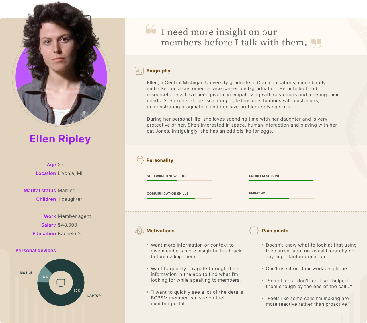
Persona #1: Ellen Ripley
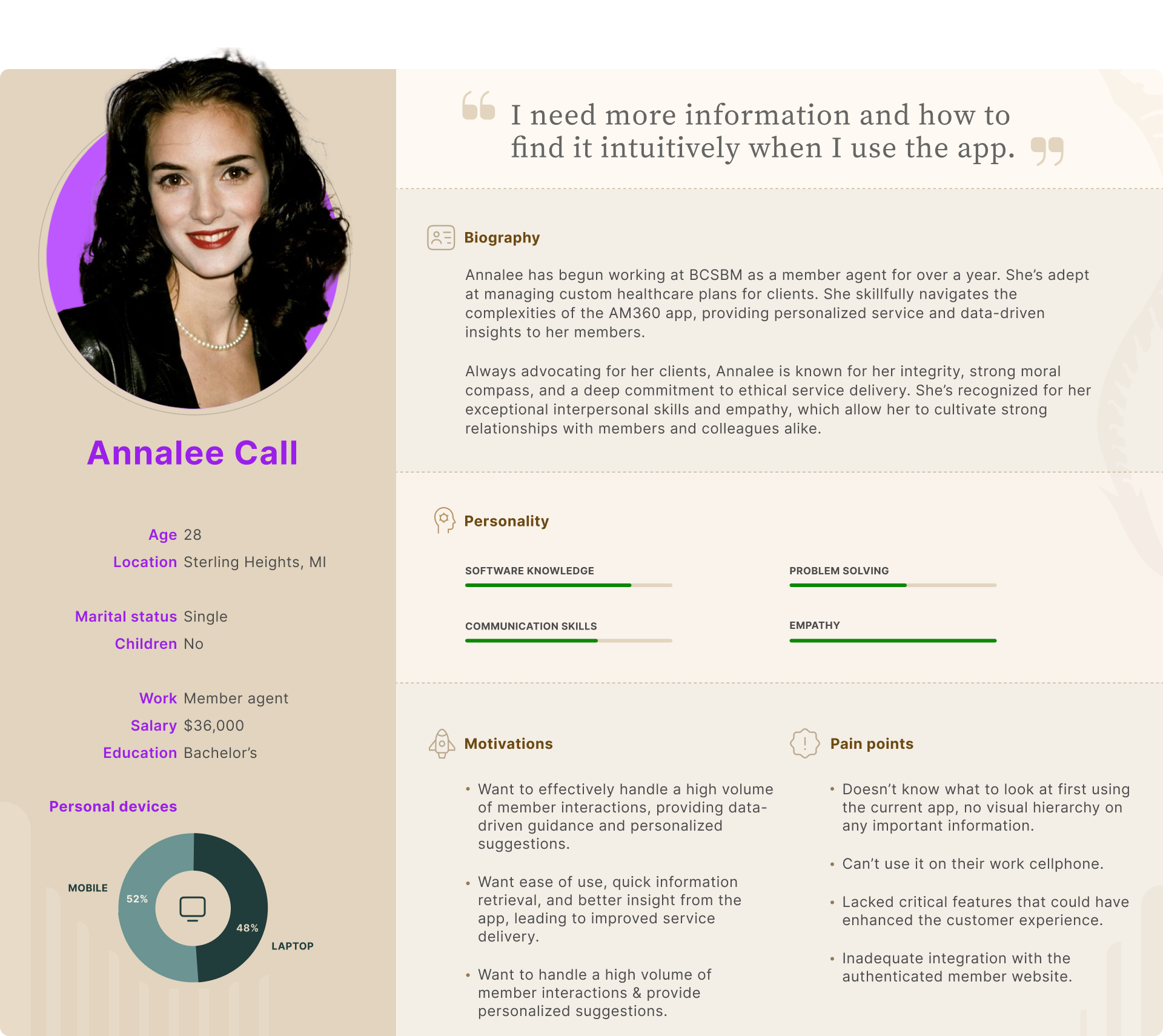
Persona #2: Annalee Call
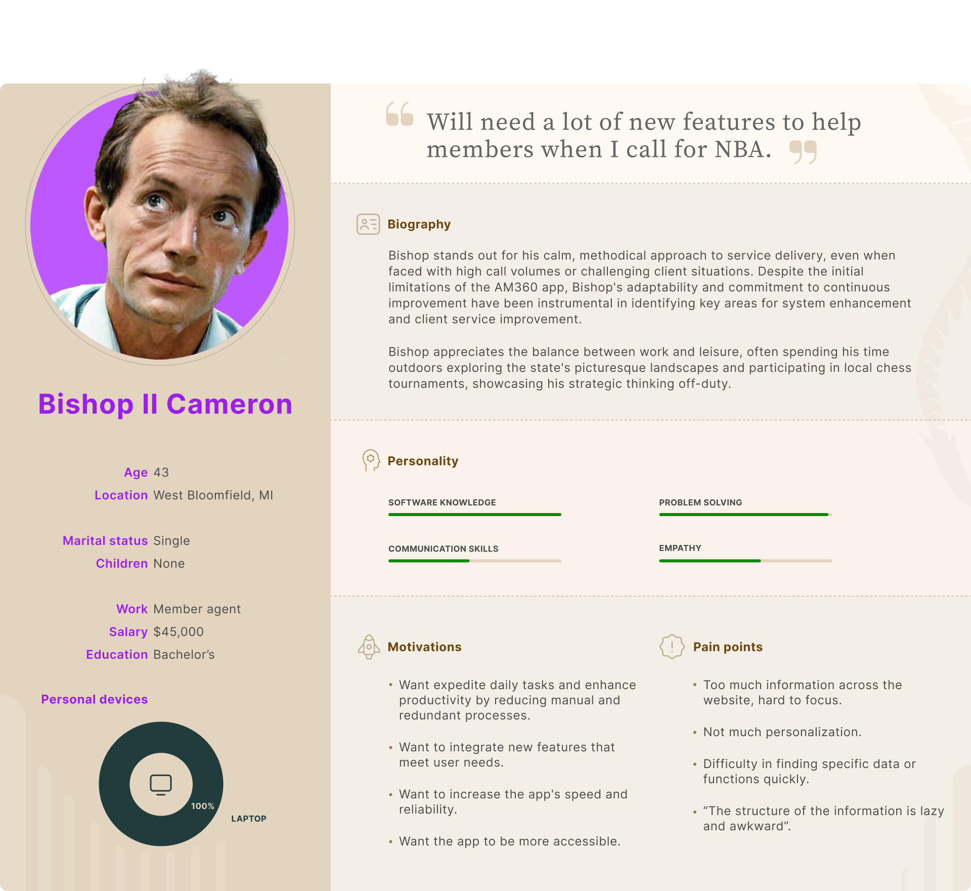
Persona #3: Bishop II Cameron
Figuring out the navigation
The earlier app's navigation posed challenges for member agents, especially with the anticipated addition of extensive contextual content in the new version. To address this, I embarked on a closed card sorting exercise. This activity allowed me to understand and organize the myriad of sub-category pages effectively, ensuring that agents can navigate through the content effortlessly.
Understanding the user flow
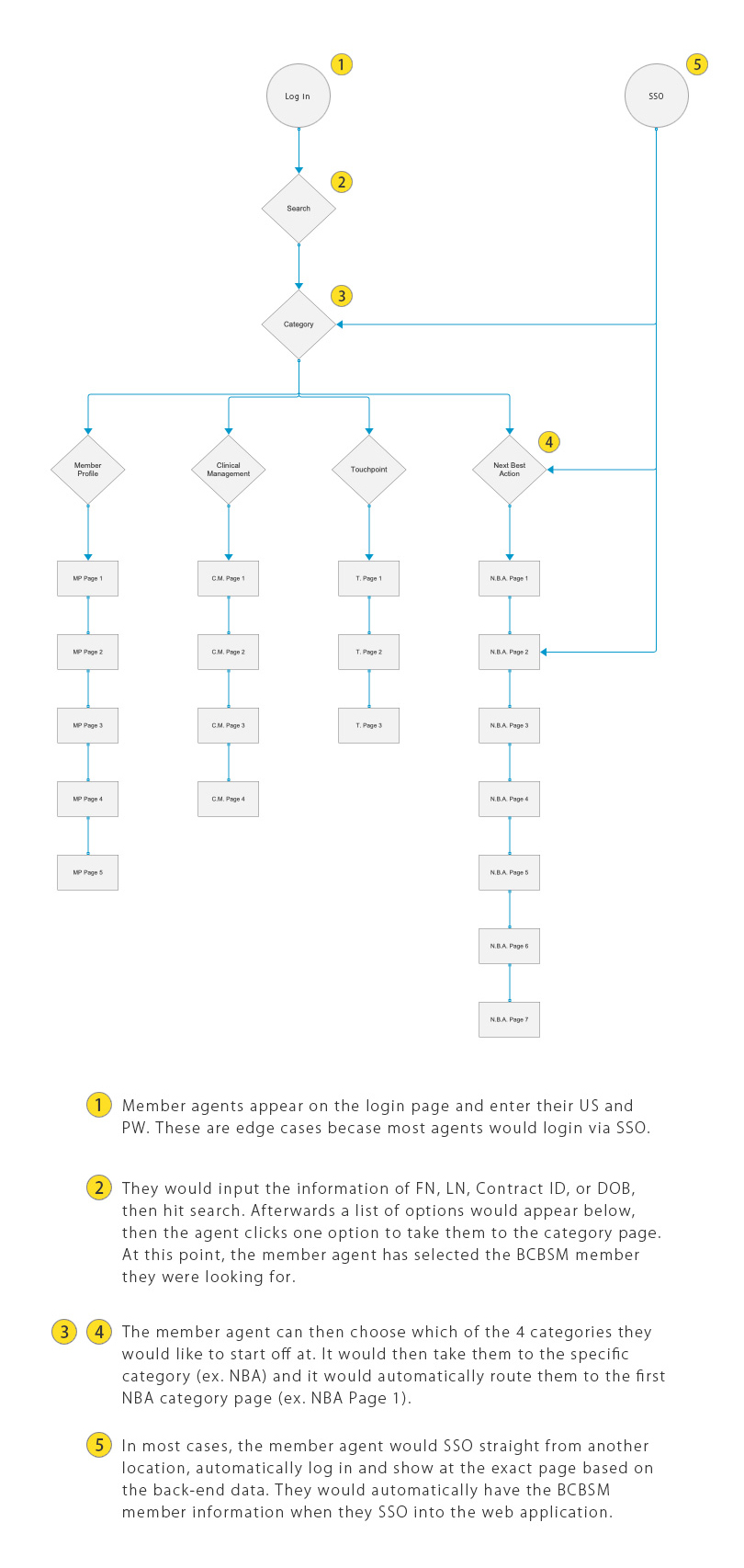
With the navigation structure in place, it was vital to visualize how a member agent would traverse the application. I crafted a comprehensive user flow, depicting potential starting points and subsequent journeys. This not only offered a roadmap for the design process but also provided leadership with a clear overview of the user experience.
User flow of the application
HMW problem statements
At this stage of the design process, I had done enough research and gathered enough data to create the HMW (how might we) problem statements for this application.
How might we streamline information access for member agents to enhance our customer service quality for our BCBSM users?
How might we simplify the navigation to reduce the number of steps required for users to accomplish tasks?
How might we categorize and present large amounts of information in a way that's easy for users to understand and digest?
How might we collaborate with leadership to identify new features that could enhance the customer experience and improve Voice of the Customer (VOC) feedback?
How might we redesign the app's color scheme to create a clear visual hierarchy and focus?
How might we make the app compatible and user-friendly across a broader range of desktop views?
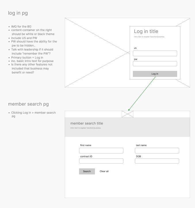
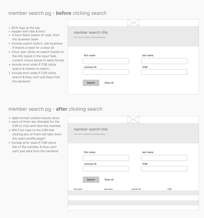
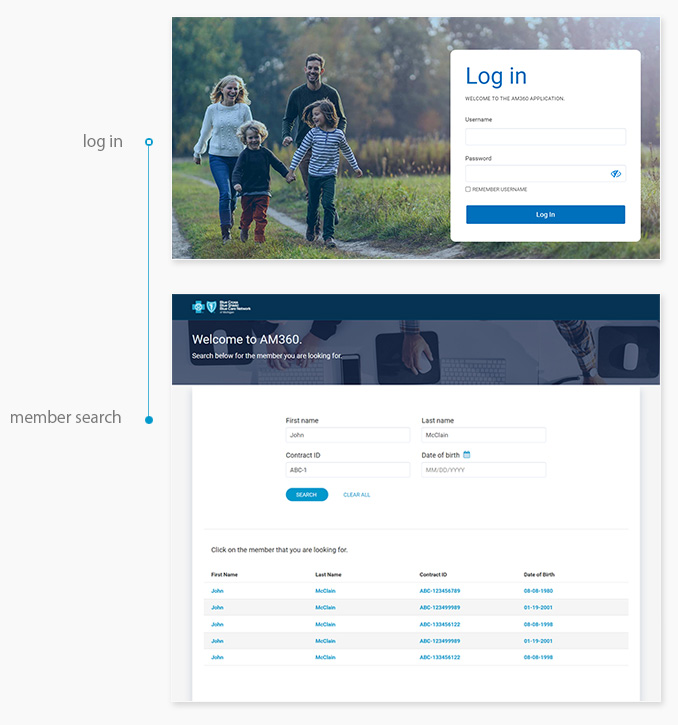
Log in & member search
Users without an SSO will arrive at the log in page. Once they log in, they will automatically get redirected to the member search page. There they can search for a member using FN, LN, Contract ID, and/or DOB to find them. The above user flow is to show the edge case scenarios. During this process, I also created some layouts and responsive designs, to ensure the app could work on desktop, tablet and mobile.
Wireframe #1: Log in > Member Search
Wireframe #2: Member Search user flow
High fidelity UI: Log in > Member Search
Categories
Less than 10% of the agents have to log in to the app. Most of the time the agents will SSO either directly into the category page of the app, or on a specific page. In these instances, they will already have the member information. I also created a way for agents to search for another member after they've finished with another user, but we had to hide that feature for budgetary reasons until the app went live to make the deadline.
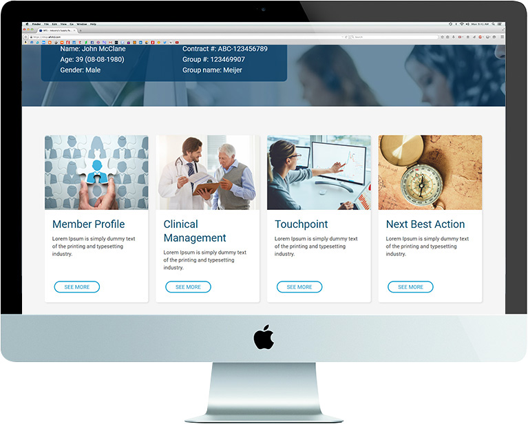
When agents SSO directly onto the category page, they are given four specific categories to choose from:
Member profile
Clinical management
Touchpoint
Next best action
Problem solving navigation
The application facilitates easy navigation across 20+ sub-categories within four main categories. By collaborating with the business team, I organized clear main and sub-categories, enabling a streamlined design. Efficiency is crucial for agents who handle numerous members' information daily. They require intuitive navigation and clear prompts to quickly find what they need.
The Member Snapshot information is always in the header because it gives the primary information an agent will first need for the member they are looking for. Agents are able to view the web app either by signing in or via an SSO.
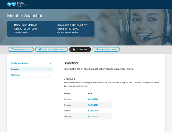
Touchpoint category > Smartbot
Category page examples
An example of one of the subcategory pages which is relating to Smartbot, a program on the BCBSM Member Portal application that is partly replicated on the AM360 web app.
The subcategory pages, such as Smartbot or Wellframe, have a fixed menu on the left-hand side for quick navigation. This feature is particularly beneficial for member agents who frequently access these pages throughout the day, as it saves them valuable time. With both the main menu and sub navigation menus readily available, member agents can work more efficiently and effectively.
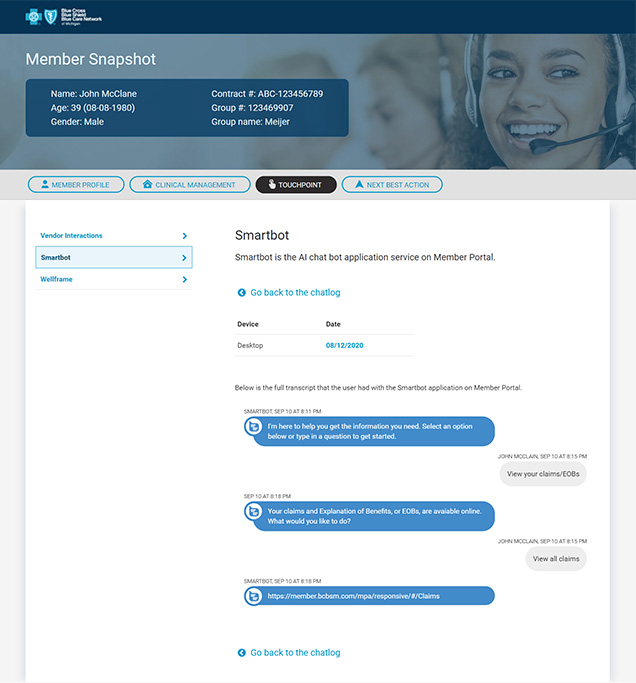
Touchpoint category > Smartbot > Clicking one of the dates
Achievements
Successful impact on customer service
With the implementation of the AM360 application, call durations saw a significant reduction as member agents could access data more rapidly. This enabled them to offer quicker, tailored assistance, enhancing overall interactions and earning positive feedback from the agents about the app's pivotal role in their daily operations.
Easy to use navigation
One significant feedback from the previous application was its navigational complexities. By engaging in comprehensive research and drawing insights from member agents' experiences, I designed an intuitive navigation system. This refined structure allowed agents to swiftly access necessary information, improving their overall efficiency and, in turn, enhancing the customer experience.
Rich feature integration
To address gaps identified in the prior application, I initiated deep dive sessions with member agents, uncovering a plethora of insights. Based on this feedback, I integrated a range of features that catered specifically to agents' needs. These additions offered richer insights and contextual data, empowering agents to provide more tailored and informed customer interactions.
Engaging user interface
In contrast to the original app's bi-chromatic design, I implemented the 60-30-10 color rule, enriching the palette with hues of blue while introducing relevant iconography and images. The use of white or light gray for background coloration improved visual hierarchy, enhancing legibility and guiding member agents intuitively through the UI elements.
Responsive design
The predecessor application, lacking scalability, was confined to a single media query. I addressed this limitation by implementing a responsive design, thereby facilitating usage across varied devices, including mobile phones and tablets, as required by member agents. This allowed for future scalability and reach.
Moving forward
I was moved to another team shortly after the product was released, but I would have liked some extra time to iterate and enhance this application even further.
Evaluate user feedback: Gather and analyze feedback from the member agents who use the application. Are there features they love? Are there pain points they frequently encounter? Use these insights to create an action plan for further improvement.
Revisit the hidden search feature: This feature was hidden due to budgetary constraints. Revisit this feature, assess its potential value based on user feedback, and consider implementing it if it is beneficial and budget allows.
Continuous usability testing: Conduct additional usability tests with member agents. Look for areas of confusion or friction and find ways to streamline the user experience further.
Category & sub-category design: After receiving feedback, I could have assessed the category and sub-category design. Are the categories still the best way to organize information, or has user feedback suggested a more efficient structure? Also, are all the sub-category pages in the categories the member agents expect them to be?
Feature additions: Based on user feedback, business needs, or technology advancements, there may be new features to be added to the application to enhance its value and usability.